
This is the last article you can read this month
You can read more article this month
You can read more articles this month
Sorry your limit is up for this month
Reset on:
Please help support the Morning Star by subscribing here
WHEN Jerzy Himmelfarb came to Britain in 1937 from Lodz in Poland, he and his partner, the artist, designer and illustrator Jan Le Witt, had a portfolio significant enough to be invited to exhibit by publishers Lund Humphries and have the V&A ask for samples of their work.
There and then, they decided to relocate to England to further their careers and Himmelfarb anglicised and shortened his name to Him, sacrificing in the process the poetry of the family surname which in Yiddish means “colour of the sky.” Jerzy is just plain George in Polish.
With his resettlement, Him brought with him the avant-garde, modernist aesthetics of central Europe to Britain, which this delightful retrospective of Him’s seminal work engagingly catalogues.
His prolific partnership with Le Witt from 1933 to 1954 rapidly established their reputation. Their services were in demand, particularly during WWII when they received a string of commissions from the ministries of information, food and war.
Other work included murals for works canteens, children’s book illustration and book covers.
Posters like Shank’s Pony, The Vegetabull — a delight to any vegetarian — or You Know a Vital Secret: Keep it Dark retain their visual impact even today, as does The Effects of Overcooking Vegetables.
The graphic clarity of the succinct messages still appeals and there is the bonus of a light-hearted humour to boot.
Le Witt and Him were masters of composition and adept at choosing the perfect colour palette for the task at hand. Him’s creation in 1950 of the imaginary county of “Schweppeshire” for the soft-drink manufacturer campaigns is the stuff of advertising legend.
His poster for American Overseas Airlines could have been designed yesterday as could Be Map Conscious for London Transport or Australian Butter.
For football fans, there is the charming The Football Revolt, still in print at www.vam.ac.uk/shop/the-footballandapos-andapos-s-revolt.html, in which the fans of Kickford and Goalbridge face a hilarious moment of truth.
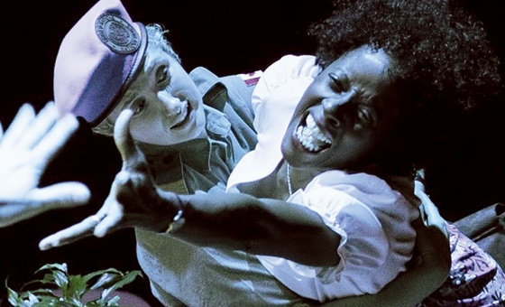
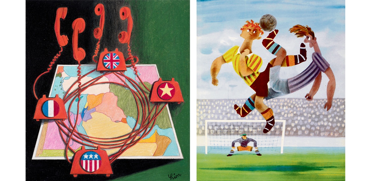
After the 1967 Arab-Israeli war, the short-lived The New Middle East magazine was set up to promote reconciliation and peace and Him, who travelled to Israel frequently where he sketched avidly, contributed cartoons and covers (pictured).
When criticised for his non-partisan position, he replied: “With more respect for each other, the two nations could live together happily and fruitfully.”
Although Him had been appointed a Royal Designer for Industry (RDI) in 1977 and was a favoured designer for Penguin Books and Transport for London, his work has had far less recognition than that of his British-born contemporaries.
He taught graphic design at Leicester Polytechnic from 1969 to 1977, where he championed design as a worthy vocation in its own right. “I managed to do for money what I would have done in exactly the same way had I been working for my own satisfaction,” he once said with characteristic candour.
When he died aged 82, David Gentleman — designer of Stop the War's iconic posters — wrote that Him’s work was “always adventurous, humorous and elegant; but it also had a simple and unassuming, almost childlike air that seemed to belie his breadth of vision and understanding.”
A fitting epitaph.
Runs until May 10, box office: houseofillustration.org.uk