This is the last article you can read this month
You can read more article this month
You can read more articles this month
Sorry your limit is up for this month
Reset on:
Please help support the Morning Star by subscribing here
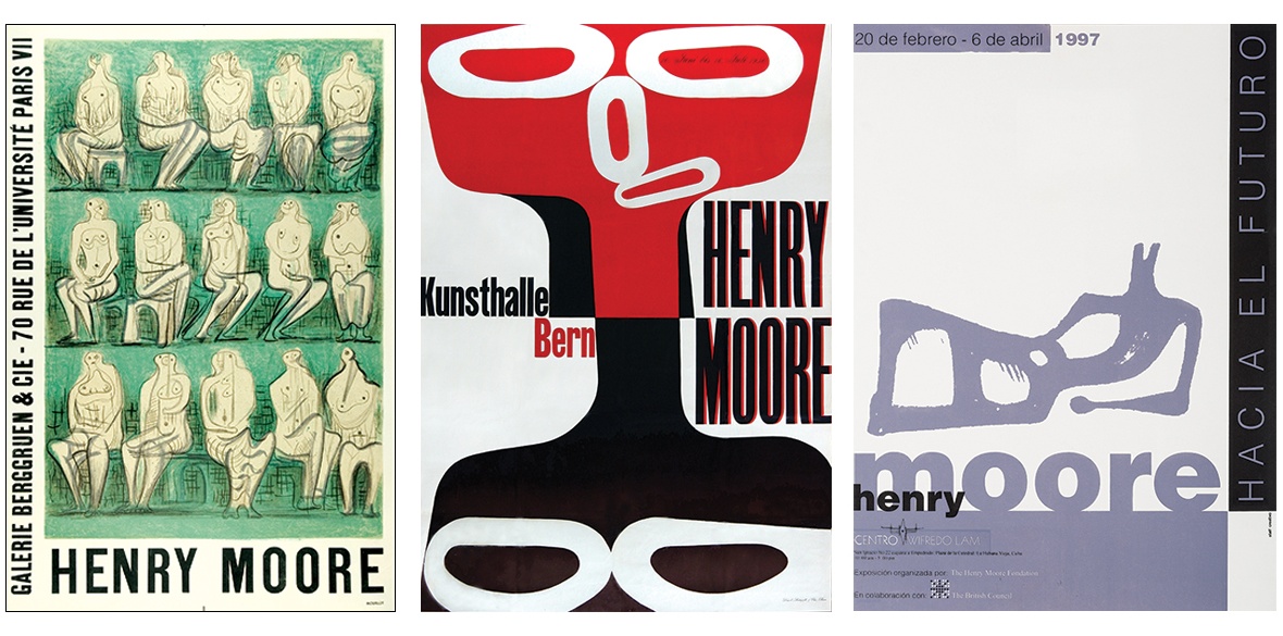
TO CELEBRATE the 125th anniversary of Henry Moore’s birth the Henry Moore Archive unveiled a fascinating digitised collection of more than 400 posters designed to signal Moore’s many exhibitions through the years.
“It’s a unique resource showcasing Moore’s exhibitions and his international reach. It’s also a fascinating look at the evolution of graphic design over the decades,” said archivist Emma Stower.
Indeed, they range from a standard, if pedestrian, informative notice comprising a photo of a sculpture with some elementary typography to those which exude graphic sophistication and are collectable works of art in themselves.
The memorable include a delectable Cuban poster for the 1997 exhibition Towards the Future at the Wilfredo Lam Centre in Old Havana, or the 1950 mischievous poster for the Kunsthalle in Bern, Switzerland.
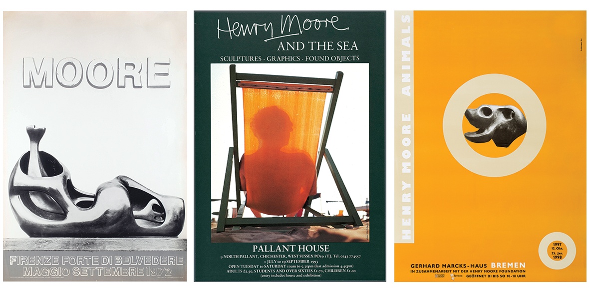
The 1993 Henry Moore And The Sea at Pallant House, Chichester delights with its ingenious tongue-in-cheek solution, while the 1957 Sculptures Et Dessins (Sculptures and Drawings) in Paris evokes animation sketches for a flip book.
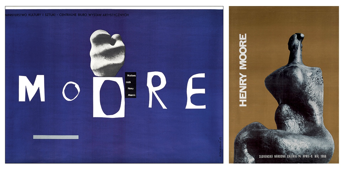
In 1966 the Slovak National Gallery in Bratislava chose a dark “totemic” figure set against a solid sepia brown — the enigma is aided by Moore’s name running vertically in white.
The austere and elegant black and white poster for a Moore exhibition in Florence/Firenze, 1972 captivates, while in the monochromatic Henry Moore Animals, Bremen 1997-8, a centrally placed circle intrigues, inviting closer inspection from scores of metres away.
Not yet in the collection is his Polish namesake’s (Henryk Tomaszewski’s) minimalist landscape poster — with a startling typographic solution across the middle — for a touring exhibition of sculpture organised in 1959 by Poland’s Ministry of Culture and the Central Bureau for Art Exhibitions.
There is an omnipresent serenity in Moore’s sculpture, and reflected in these posters, which is life-affirming. Drawn from a meticulously studied balance of forms, this lack of “drama” is as soothing as it is engrossing.
The familiarity of the themes seduces with empathy and solidarity, hence the continuing appeal of this work that represents unassuming, everyday humanity.
Many of Moore’s sculptures emanate a gentle, self-deprecating humour that has more to do with playfulness and mischief than lofty formal ideals. He owes this down-to-earthness to his working-class background — Moore’s father worked as a miner all his life.
Henry, in the first of many such visits, ventured down Yorkshire’s Wheldale Colliery, where his father worked, in December 1941. In part it was a reaffirmation of his commitment to the working-class cause and artistically he was drawn in by the irresistible challenge of drawing that “dense darkness you could touch.” Asked about the conditions his comment was succinct: “If one were asked to describe what Hell might be like, this would do.”
A compendium of this work Drawing in the Dark: Henry Moore’s Coalmining Commission was published in November 2022.
The fact that Moore elevates the quotidian and becomes its aesthetic custodian — recognised throughout the world and across cultures — is the rarest of creative feats, well attested to by this admirable initiative.
Henry Moore exhibition posters can be viewed at https://catalogue.henry-moore.org/collections/44285/posters/objects