ANGUS REID, ANDY HEDGECOCK and MARIA DUARTE review On The Sea, A Useful Ghost, Brunello: The Gracious Visionary, and Pinocchio Unstrung


Style over substance
Art Deco borrowed from Bauhaus and Soviet Constructivism but ignored their core social commitment, writes CHRISTINE LINDEY
RON JACOBS enjoys a great tale, told by a US communist, of the lives of working-class New Yorkers
BRENT CUTLER searches a new history of contemporary Iran for an understanding of the Islamic Republic, finding both interesting detail and glaring omissions
MARIA DUARTE recommends the true story of the remarkable woman who sued Donald Trump for sexual assault not once, but twice
KENNY MacASKILL is disappointed by a polemical, rather than factual, account of the Lone Star State and its political path since the civil war
PAUL DONOVAN is fascinated by the lives of Charles and Mary Bagot, and the insight this biography shines on the morals of pre-Victorian society
GORDON PARSONS appreciates fine performances and a feel for ambiguity, but misses the music of the dialogue


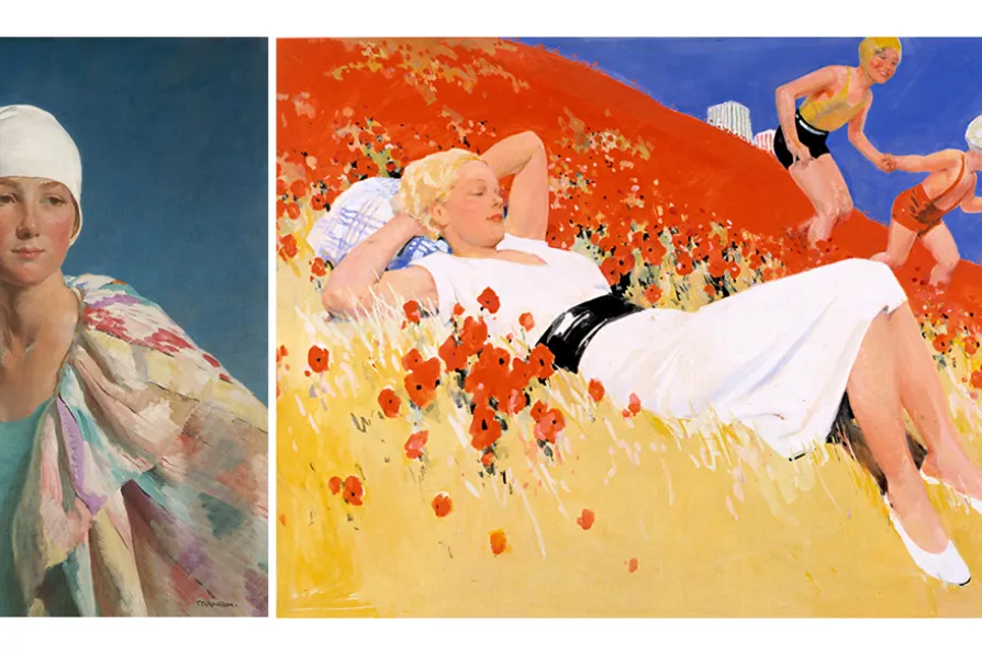
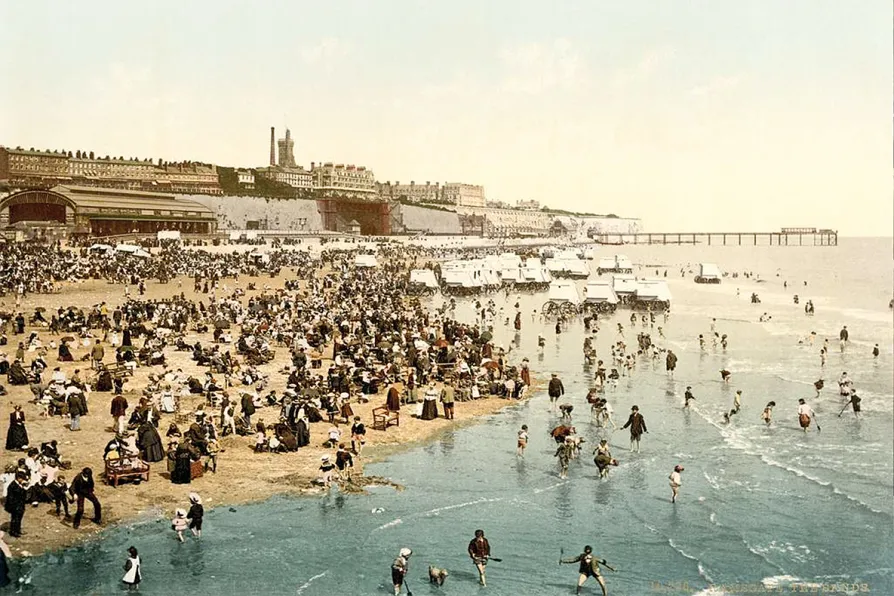
Exhibition I Art Deco by the Sea,
Laing Art Gallery, Newcastle-Upon-Tyne
AS WE face winter’s gloom, how lovely to dwell on the sunlit seaside pleasures of warmer days.
The Laing Art Gallery’s exhibition, Art Deco by the Sea, conveys these through drawings, paintings, photographs, fashion, plates, furniture, ceramics and textiles from the 1920s and 1930s.
Originating in France, this sleek new style signified fun, sophistication, modernity and a rejection of fusty, claustrophobic Victorian and Edwardian times.

Similar stories
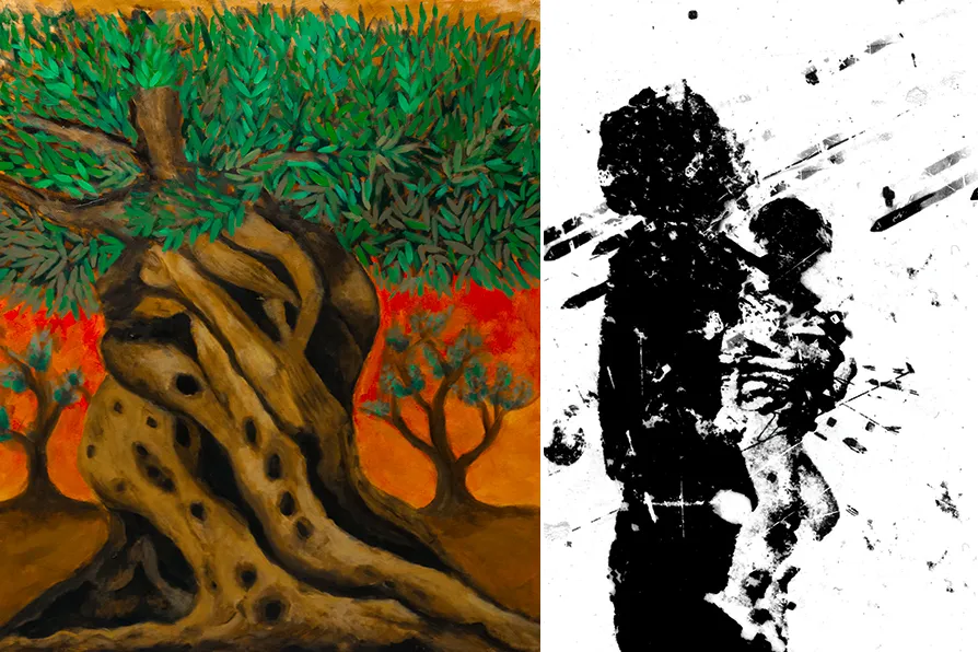
JAN WOOLF invigilates images that meditate on Palestine, and the people who witness them
The summer saw the co-founders of modern communism travelling from Ramsgate to Neuenahr to Scotland in search of good weather, good health and good newspapers in the reading rooms, writes KEITH FLETT
The creative imagination is a weapon against barbarism, writes KENNY COYLE, who is a keynote speaker at the Manifesto Press conference, Art in the Age of Degenerative Capitalism, tomorrow at the Marx Memorial Library & Workers School in London
Paul MacGee of Manifesto Press invites you to a special launch on Saturday August 2.