PCS general secretary FRAN HEATHCOTE explains why opposing war is inseparable from defending jobs, wages and public services – and why readers should come to the London Peace Conference on Saturday June 20

Isotypes: getting the picture
ROX MIDDLETON, LIAM SHAW and JOEL HELLEWELL explain how a ‘picture language,’ driven by a remarkable pair who believed everyone should be able to digest complex information, helped to influence modern scientific data visualisation


As protests erupt over Henry Nowak’s murder, ANDREW MURRAY argues that anger is being exploited to advance a wider racist and anti-immigration agenda
CARLOS MARTINEZ explains the sound case for car manufacturing co-operation with China
The National Emergency Briefing outlines the need for urgent action to address environmental crisis, says PAUL DONOVAN, warning that there’s no time to indulge the arguments of the fossil-fuel-funded climate-change deniers
Campaigners say criticism of Labour MP Stephen Morgan’s position on Gaza has been met with police intervention and cancelled opportunities for debate. HESTER WOLFE reports
The Committee for the Defence of Iranian People’s Rights warns of escalation danger in Iran war


THE Covid-19 pandemic has created a situation where many non-scientists are looking intently at graphs, numbers and diagrams. Aside from complex questions such as how to make fair comparisons over time when definitions may have changed (the topic of our last column), the problem of showing the data itself in a fair and clear manner has prompted a great deal of argument.
As well as official government graphics, many newspapers and websites have in-house teams who produce their own graphs, updated in real-time. What’s more, individuals on Twitter pass around their own homemade graphs like scientific samizdat. Often they are using the same underlying data but are “visualising” it differently.
For example, whether a graph uses a linear scale or a log scale can change what it looks like, which can lead to different impressions about the severity of the situation. Those making diagrams regarding Covid-19 also need to decide how to show numbers visually; for example, data from scientific experiments has been used by designers to make graphics highlighting droplets drifting over a room after a cough, aiming to make the invisible visible in a “realistic” way.
The concept of “data visualisation” may seem recent, but its analysis goes back over a century. One important influence on modern data visualisation was the so-called Isotype School, founded by Otto Neurath. Neurath originally called his system the Vienna Method of Pictorial Statistics.
He felt that even if people were illiterate, they should be informed and educated about societal issues. The fundamental aim was to convey quantitative or procedural information without using words.

Similar stories

RICHARD SHILLCOCK examines an enjoyable, but philosophically conventional book, and urges Marxists to employ their capacity to embrace the totality in any explanation
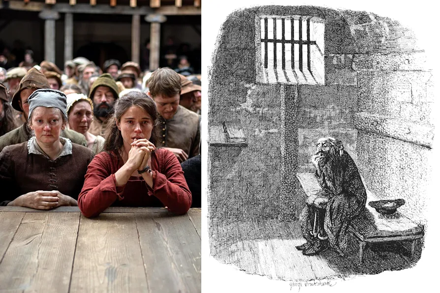
JULIA THOMAS unpicks the mental processes that explain why book-to-film adaptations so often disappoint
JOHN GREEN’s palate is tickled by useful information leavened by amusing and unusual anecdotes, incidental gossip and scare stories

In the second part of a two-part article, CONOR BOLLINS asks why the government’s ambition when it comes to the military is not applied to sectors where it could do real good