The bard celebrates two other fine practitioners of the art, and laments a lost brewer

The Olympic Games logo design credibility quagmire
Although half of the Tokyo games are now history - the Paralympics have only just begun - the design for the Paris Games in 2024 has already drawn well-publicised censure. CHRISTOPHER BROWN looks at the perceptions that inform the recurring debate


This right-wing conspiracy theory is used to justify the coercive measures against gender, race and labour rights that best serve capitalism, attests GAVIN O’TOOLE
KENNY MONROSE recommends a new exhibition that highlights the significance of Black British music
ANGUS REID is bowled over by an exuberant film about the making of Keith Jarrett’s legendary concert
MARIA DUARTE, FIONA O’CONNOR and ANDY HEDGECOCK review Savage House, Enzo, Madfabulous, and Erupcja
CHRIS SEARLE recommends a work of love and deep admiration for a great musician


IN 1913 Baron Pierre de Coubertin, the founder of the modern Olympic Games, created one of the most recognisable logos in the world.
The symbolism of the five coloured interlocking rings, representing the participating continents and the “flags of all nations” united in sporting endeavour, is simply conveyed and easily grasped.
A good logo communicates its message in an effective visual way and de Coubertin’s certainly achieves that. It has become the basis upon which logos for the Games are built.

Similar stories
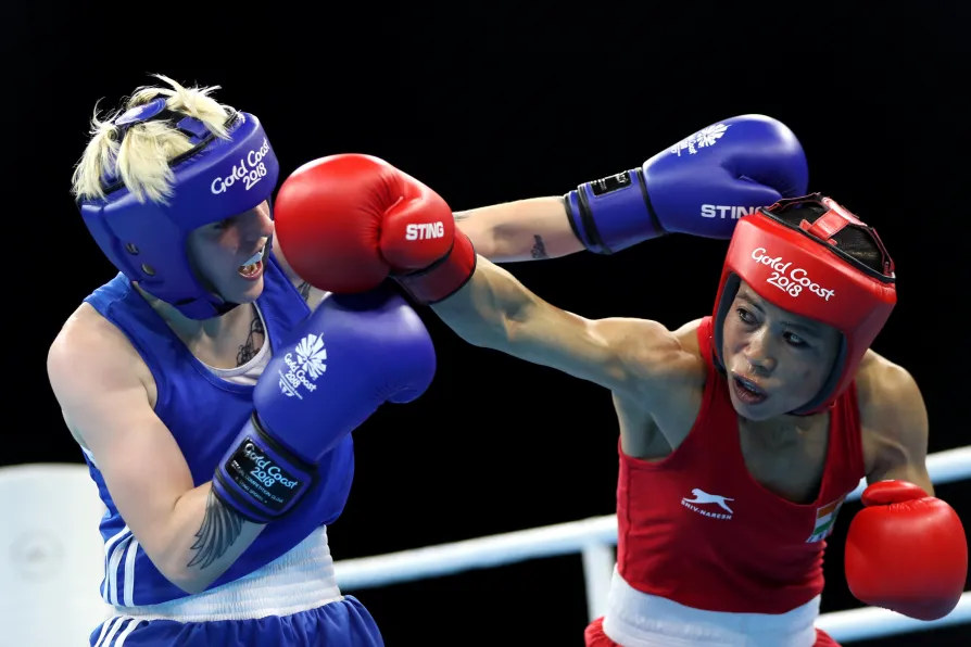
Mary Kom’s fists made history in the boxing world. Malak Mesleh’s never got the chance. One story ends in glory, the other in grief — but both highlight the defiance of women who dare to fight, writes JOHN WIGHT
BLANE SAVAGE recommends the display of nine previously unseen works by the Glaswegian artist, novelist and playwright
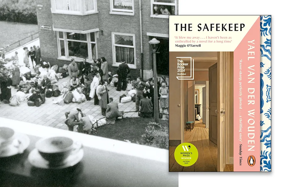
MANJEET RIDON relishes a novel that explores the guilty repressions – and sexual awakenings – of a post-war Dutch bourgeois family